I received the proof copy in the mail today! Underneath the cut are some photos of it; it's not perfect yet, but I'm pretty pleased with the overall quality.
The book itself is a bit bigger than I'd really anticipated, but it's not oversized. It's 8.5"x5.5", which is a standard size. It's smaller than 6"x9", at least, which is another standard size I could have used.
The cover turned out much, much darker than it appeared on my screen. I was pretty surprised by this, but I don't think it'll be all too difficult to fix. My name is virtually unreadable on this copy, though.
This photo is in slightly different lighting, but the conclusion is the same--not enough contrast. Fortunately, I sent an email to my cover artist when I started writing this post, and she responded with a lightened image even before I finished, so this should be taken care of!
I was pretty excited to get a look at my title page, which took forever to format nicely. It's not flashy, but I think that it looks pretty nice. I'm also pretty fond of my logo.
I know that not everyone will initially see it as Q.P., but I've always been inordinately fond of the cursive Q. As a result, I'm pretty pleased with how this looks!
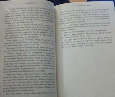
Here's the first page of the book. I'm not sure whether there's too much space between the chapter heading and the first line of the chapter. I'll have to think about it. I do have to admit that I rather like how dense the book looks. Is that strange? It's a reasonable size for reading, though, at least when compared with some of the novels that I have sitting around the house.
Of course, one of the main benefits of having more text on each page is that the overall number of pages gets reduced, which lowers printing costs. As it is, I've set the paperback's anticipated price so that I get about $0.50 when people buy it through expanded distribution channels. That's at $9.99. But if Amazon and the book stores both want a cut on top of the printing costs, the pie gets eaten up pretty quickly.
Here's an example of both some of the interior art alongside the text in the book. I'm considering whether I want to adjust the margins so that there's more room on the inner edge and less on the outer, but I haven't yet made up my mind.
Unfortunately, the back cover is the part I find the most dissatisfying. It looked fine on my computer, but it looks amateurish and generally shoddy in person, I think. It may be the fact that I'm using a simple, basic font, or it may be the overall layout of the page. Either way, I expect that I'm going to have to fiddle with this to make it work.
But this is exactly why draft copies are important! Since I'm pretty well ahead of my initial schedule, I have plenty of time to correct all of this and send in for a new draft copy. Hopefully I'll have the last two images by the time I finish fixing all of it!
Overall: The book feels good in hand, looks nice on the interior, and the exterior will be fixed by the end of next week, hopefully. You'll all get to see the next draft copy as soon as I get it!


No comments:
Post a Comment